Pages

The Future of Power: Scale Matters

Fusion reactors. Real life has finally caught up to Sim City.

I'm excited about this from a technological standpoint, even though I don't know enough about the history of its development. The last paragraph is what caught my eye the most:

Five years after that, they expect to have a fully operative model ready to go into full-scale production, capable of generating 100MW—enough to power a large cargo ship or a 80,000-home city—and measure 23 x 42 feet, so you "could put it on a semi-trailer, similar to a small gas turbine, put it on a pad, hook it up and can be running in a few weeks."

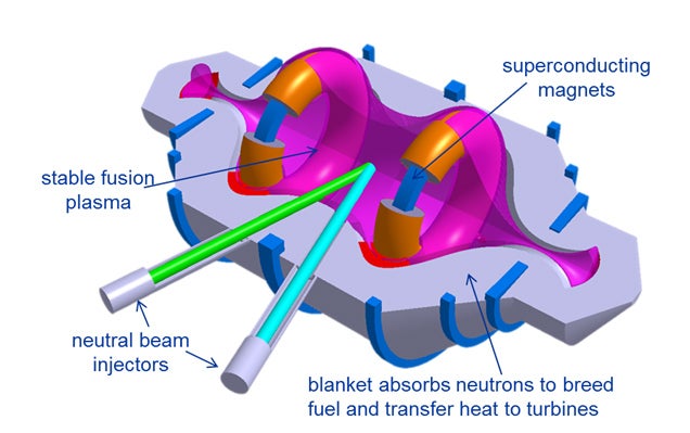
The key is the scale. This is something that can work on the scale from a large vehicle to a small city.

Modern energy development so far has always been large scale. Large scale fossil fuel plants, large scale oil delivery infrastructure, large scale nuclear power plants, large scale power grids. One of the key differences not being talked about with the changing energy landscape is how the scale is changing. Wind farms and solar farms exist, but especially for solar the major push has been for personal solar panels. 

Here is something that falls in the middle. Smaller cities and larger vehicles seem to be the perfect candidate for a power source of this size.

Overall, this means that in the future there will be no magic bullet to wean us off fossil fuels. What we'll end up with is a more nuanced mix. Consider the below hypothetical situation based on medium scale fusion reactors being added to our energy mix:


In this case, you can see how this new energy mix will shuffle out. Starting at the bottom, solar energy will probably remain the most efficient way to power individual homes. More people will have the option to disconnect from the grid and become completely self sufficient on their own.

For the next step up, small towns would be at the perfect scale for Fusion Power. This setup too would allow the option of connecting to the grid. One could imagine this as homesteading on a grander scale. A community of like minded people might come together and purchase their own fusion reactor, or a development company may specialize in building small self sufficient communities for a niche market.

For large scale farming and light industrial regions, renewables become cheaper once again. In this case, wide tracts of land can double as power generation. In addition to fields of crops or out of the way warehouse locations, there can be fields of windmills or solar farms. Once again, these types of regions would have the option to plug into the power grid.

Last at the high population end of the spectrum you have large cities. These cities will have no choice but to stay connected to the grid. While efficient on a per capita basis, their density prohibits these smaller scale energy sources. They would have to source their energy from elsewhere. I use fossil fuels here in the cost curve, but of course any electric grid is going to include a mix of power sources. Until transmission and storage are improved (and if solar powered jet fuel becomes a thing, it will be,) fossil fuels are going to be most efficient at this end.

Looked at this way, one of the reasons why the fight for renewables has always been cast as big business vs little people becomes immediately apparent. Large corporations will do whatever is profitable. If renewable energy is profitable, then that is what we'll get. The problem isn't that it's not profitable, but it's not profitable at the scale that these companies currently operate at.
Read more ...

The Problem of Measuring Average Neighborhood Housing Prices

Even today, it's very normal to see high double digit housing price numbers in New York neighborhoods.The thought recently came to me however of new developments' effects on prices and what this means to homeowners.

Without taking development into account, housing prices get skewed. If newer buildings are added, the average price of a house will not be a reliable indicator of how an individual property is expected to perform. 

To see how unclear this sort of measure makes things, consider a neighborhood with a group of equal units worth $300,000 each. Over a period of time, those units increase to $310,000. During that same period, the housing stock increases by 25%. and these new units are of higher quality and worth $600,000. 

The average price of this neighborhood is now $368,000, and one would be tempted to say housing prices have increased by 23%. While true, this has absolutely no bearing on what will happen to your individual house. Based on the evidence, all one can say about the neighborhood is house prices increased by 3%,

This sort of mismeasurement has several implications. Expensive new development leads to a price differential between new and old units. This is a direct causal link between new development and increasing prices in existing units, which may or may not be counteracted by the increasing supply further satisfying demand.

More importantly, this does something to the psychology of real estate. In an area with increasing housing values and at least some development, the average price of a neighborhood will ALWAYS overestimate what's actually happening to each individual house. But, you can be sure that developers will point to this number when trying to sell $600,000 units. 

Overall it just proves how important it is to really think about what measurements mean. Something that may seem clear may actually be systematically misrepresenting what you truly would like to know, and uncovers unseen mechanisms in a market. 
Read more ...

A Few Thoughts on Satellite Sourced Economic Data

Ever since Richard Florida cited this data set in Who's Your City, I knew this was both a novel way to look at economic data, and would have problems that need to be sorted out. Florida just wrote a feature about this data set for city lab, and it really highlights a few of the easy improvements that can be done to improve this data. With a little training, this can very accurately predict economic activity.

The first paragraph highlights one of the first problems one would run into:

Looking at aerial images of nighttime lights can tell us a surprising amount about human activity on the ground. Satellite images of the world at night have been used to see how North Korea's political isolation has left its residents in the dark, and how Texas's booming oil industry has spread across the landscape. As Yale University economist William Nordhaus has noted, roughly 3,000 studies have used nighttime lights as a proxy for various economic activities just since 2000. 
Looking at a picture of Texas they linked to in another article, the difference between these sorts of economic activity becomes apparent:


The potential problem this can cause is explained further into the piece:

Their research found that the satellite data correlated more strongly with population density than with economic measures, finding close statistical associations between luminosity levels and population levels, population density, the number of establishments, and the number of employees. But the satellite data were considerably less accurate in estimating for a key measure of the level of economic activity—wages. Based on a geographically weighted regression analysis, they found that nighttime light levels overestimated wages for the largest cities like Stockholm, Gothenburg, and Malmo, where together more than 40 percent of Sweden’s population resides. In contrast, satellite images generally underestimated wages for smaller towns and rural areas.

My first impression of this statement is what would lead someone to think wages are correlated with light levels within a country? I could definitely think of reasons why wages would be correlated with light levels when comparing countries, and would definitely be useful in comparing wages between urban and rural areas. When comparing urban areas within a country however, I'm not surprised smaller cities are underrepresented. I definitely believe that, within the same country, larger cities would have higher wages than smaller cities. I simply think that this is not proportional to the amount of light you emit. To put it another way, adding one more household to a small city will have a greater impact on the light output than adding one more household to a large city, since larger cities are more efficient.

This may seem unrelated to the energy economy in Texas, but that picture allows me to highlight how to fix this problem. The new energy economy in the United States is perhaps one of the biggest examples of economic activity taking a unique spatial form in a very short time. Over a period of years, the prospect of fossil fuel independence became very real for North America.

The pinprick pattern of energy development would be very easy to pick apart from more general urban economic activity. Combined with existing data of well production (full disclosure: I work for a company that could provide this data!) A computer could look at these satellite images and automatically pick up energy regions.

This is a very clear example, but this could also be used to try to improve this model for wages. Once again, there's a fairly clear pattern: smaller cities are getting overestimated and larger cities are getting underestimated. One could train a model to pick out contiguous metro areas, measure their size, and properly control for the efficiency effect I hypothesized above.

In this way, satellite data can be fine tuned to the economic concepts we want to. Premise has done amazing work in analyzing pictures to track price and quality of goods data across the developing world. With a similar sort of evolving model, other macro concepts can be predicted as well.

One more thing satellite data could be used for is determining whether growth is "healthy." In Cities and the Wealth of Nations, Jane Jacobs explains 5 ways city regions can grow. When they act in concert, they can transform formerly inert land into economically productive city economies. When they act in an unbalanced way, they lead to economic imbalances that may seem healthy in the short term, but in the long run are damaging and can only lead to ruin.

In the context of satellite data, this sort of balanced city growth should have a very noticeable pattern. There's a reason why slime molds can accurately predict train systems. If done in a healthy way, balanced growth should follow an organic pattern.

Compared to organic looking cities, the growth in the US energy sector seems very haphazard at first glance. Using Jacob's categorization, these regions look like supply regions, which instead of replacing their imports become addicted to the outside city economic activity that led to its founding. Some of the effects of this are positive: Texas and North Dakota have some of the healthiest job markets in the country, but it won't lead to long lasting economic development, and once this activity dries up, the regions will return to inert and we'll have a lot of upset unemployed oil workers.
Read more ...

The Open Source Economics That Caused Heartbleed and How to Prevent it From Happening Again

The Heartbleed bug has seemingly shone a light on the dark side of our open source architecture. The benefits of open source have long been known: it's free and you have a large community of users that will continuously improve the software. It's a naturally occurring collaborative arrangement that seems to beat the other corporate options out there. 

The downsides have previously been less publicized, but have always been there. Many large corporations have moved to open source, but there is a reason why some stick to commercial solutions. I work for a company that creates commercial data analytics software, and while I am a huge proponent of open source alternatives, I see why clients turn to us rather than open source alternatives like R, Python, or Gretl. If you're using an open source option, answers are almost always a google or openstack search away. If you're using a commercial option like my company's, you'll be able to get an expert on the phone who can show you what to do (that expert would probably be me.) At its core, the main service my company provides when compared with open source options is our company assumes responsibility for the software we produce.

This dynamic is why it took two years to notice Heartbleed. There was always an active development community surrounding it that in many ways is more dynamic than any commercial community can be, but no one ultimately can be held responsible if things go wrong. Cyber security is something that users won't notice unless it fails. Open source dynamics do many things right, but this is not one of them.

In my industry there is also the beginnings of a solution to this problem. Companies such as Revolution Analytics and Continuum Analytics have emerged as the commercial face for open source R and Python respectively. The underlying architecture is free, but companies like these are able to add consulting services or custom addins to open source software.

The dream of open source was that users will be actively maintaining the environment. While this has come to fruition in terms of upgrading user centric functionality, there are some holes, and ultimately no responsibility. This evolution in open source economics allows us to have it both ways. We can get large open source communities, but also have pay options available for those who need it. The providers of pay options can begin taking responsibility for software, and care about it in the same way commercial providers do. Large open source userbases provide the externality of a well maintained infrastructure that these consulting companies can take advantage of. Consulting companies, worried that their paying clients wouldn't trust the software if it had security and other non-user centric bugs that would never be noticed by volunteer communities will work to fix them, providing an externality to the free user community.

Much has already been written about how we need to pay people to solve security issues. Grants might be feasible in the short term, but the industry arrangement I describe above came about fairly naturally in data analytics. I don't see why something like this can't be encouraged elsewhere.
Read more ...

Uber Wants to Replace Your Local Department of Transportation


If you were unsure about what Uber's long term goals are, their April Fool's joke makes things crystal clear. Along with surge pricing, Uber is testing long held consumer assumptions about transportation.

It's not acknowledged as such, but there are truly limited choices when it comes to transportation. You have your selection among available cars, but car ownership itself is a bundled package. You're paying a hefty premium to be able to use your car whenever you want. On the other side of the spectrum, you have the option of a completely fixed public transit system. For a very low price, you're able to get from fixed points on a preset schedule. Compared to your other options you're getting a bargain, but you are constrained by the lines and timetables on your transit map. Cabs have always been in the mix as well, but are closer to cars on this spectrum: you're paying a premium to choose your pickup and dropoff location on your schedule.

I previously thought it would take a widescale adoption of driverless cars to bring about this sort of change. Uber is trying to break long standing consumer expectations and make people truly think about what they want when it comes to transportation. Looking at private cars and public transit as two sides of a spectrum, Uber is trying to give consumers a choice of any point between them. You can pay through the nose for a cab to pick you up right outside the bar now. Paying $2.50 is great, but you may not want to wait 45 minutes for a subway. I'm sure there are lots of people out there who would be willing to pay something in the middle to walk a block and wait 8 minutes for the next shared cab to come. Especially when you know exactly where it is on your phone.

This system is not even novel. In New York, several major outer borough streets leading to express subway stations have informal rush hour cab share systems. Over time, cabbies have begun picking up people at bus stops, and usually charge around $2 per person. Someone waiting for the bus in the morning can choose to pay $2 more than they normally would to get a faster ride now rather than a slower trip 8 minutes from now to the subway station.

When Uber builds up its fleet of cars and institutes this sort of pricing en masse, this April Fool's joke will look hilarious in hindsight.
Read more ...